Pages

Monday, June 30, 2014

The Truth About Artists

phrase.jpg

The truth about artists


This morning, I decided to write about a message that came to my head while I was driving back home yesterday. It's interesting sometimes how God pops words or phrases in your head when you least expect it.

For those of you who are still confused on the meaning, I'll try to break it down as easy as I can. At the end of the day we all are artists, but in my opinion, not just anyone can be called a true artist. A true artists mind is more than just what's shown in the present. It's about visually exploring what hasn't been done yet.

Artist vs. True Artist


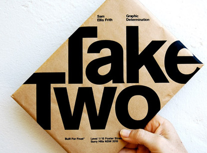
Now, let's say for example, your project for a client is to come up with a logo that has a penguin in it. The image on the right is a great example of true art. Typically, letters don't automatically come built in to look like anything other than letters. Someone had to truly see this in their head, which is a skill that many people (and I do mean many) people can not attain. Most people would come up with some kind of design similar to the one on the right and be done with it but it took a very creative mind to come up with one that is made from just letters. Here's some great logo inspirations in case you still aren't clear on artists compared to true artists.

I was thinking about college too when I wrote the phrase above and remembered the type of artists I bonded the strongest with, which were the true artists. For most people in the art department, they would come and go whenever their classes were finished, but there were a few( and I do mean three or four people) that would stick around and really craft their skill. They would stay late, think outside the box, continue working on their craft, come up with great work, and sometimes while working, others would just stare in awe at their work asking how in the world they could have imagined and created their masterpieces. It was these kind of artists that I knew I had to learn from and fast. Though they were great artists, most of them graduated before I did and I knew I had to hold onto the knowledge and wisdom they had shared with me for the rest of my life.

So the question now is, what kind of artist are you?

Thursday, March 27, 2014

Design Tip: Adobe Flash Shortcut Keys


This article is all about Adobe Flash. For those of you who don't know, Adobe Flash is a multimedia and animation program.

Adobe Flash Shortcut Keys


q- Free Transform: used to change an objects angle or size
w- 3d Rotation Tool: allows you to take a 2D object and be able to rotate it on a 3D plane
e- Eraser: erases parts of a path or fill
r- Shape Tool: used to create rectangles, ovals, geometrical shapes, etc.
t- Text Tool: allows you to make text 
y- Pencil: acts similar to a real pencil and is used to create paths
u- Deco Tool: decorative drawing tool used for making shapes
i- Eye Dropper: used to pickup a color from an object
o- Primitive Tool: create shapes such as rectangles and ovals and control the amount of corner radius, size, and other properties of the shapes
p- Pen: helps you make curved paths and perfect straight lines

a- Sub selection: lets you choose specific anchor points and move them on an object or shape
s- Ink Bottle: puts a stroke around an object or change the style and color of the stroke itself 
f- Gradient Transform: allows you to change the path and size of a gradient fill
g- 3D Translation Tool: brings depth and distance to an object by moving it on the x, y, or z-axis
h- Hand Tool: lets you freely move the stage and work area around
k- Paint Fill: allows you to fill an area with color
l- Lasso: makes freehand selections around points on an object

z- Zoom: magnify more or less of a specific area on the stage
c- Convert Anchor Tool: change the curve orientation of a point
v- Selection Tool: allows you to select objects and move them freely
b- Paintbrush: create brush strokes and fill areas
n- Line Tool: used to make lines
m- Bone Tool: allows you to connect symbols and shapes together to create a character shape which can be moved, changed, and turned into different animation cycles

Saturday, March 22, 2014

Design tip: As a freelancer how much should I charge?

What do I charge for my work?

After talking to a friend of mine who is just starting in graphic design (check out her awesome work at Natasha Designs), I decided it was necessary to give you my opinion on this subject based on my own experiences. For me, coming up with a price list was the hardest thing in the world to do. Forget trying to make a logo or designs, this right here topped everything. I read chapters in some graphic design business books, asked my teachers for help, looked online in group discussions, checked YouTube, but at the end of the day, I still felt uncertain.


Price?!


One reason why it's so hard to make a decision on how much to charge, is because there is no set price on any of the work that we do. If anyone tells you that there is a set price for all designers, then they are lying. You can read all the articles and guides that you want and try to follow another designers example but as a freelancer, nothing is set in stone. You have to make sacrifices. If you need money to pay rent and the only client you get can only pay half, then that's better than nothing at all, in my opinion. The best thing to do is get a mentor who has been in the same shoes you have been and learn what you can from them.


Know what Minimum Wage is


Just a good tip...you want to charge more than minimum wage. Make no mistake, the kind of service we do is a crucial factor for businesses around the world so don't ever think otherwise. Now here in the US, it is $7.25 where I'm at and if you are here in the states as well, go to the United States Department of Labor and see for yourself.


Know your Worth


This factor in determining your prices is extra crucial. You have to be confident in your skills when you make your prices. If you don't know what you are worth, then you need to re-evaluate your life and the career you chose. Uncertainty can lead to epic failure sometimes, just remember that.

Price Range Examples


If you are managing content for a client and they put you in charge of all printed media, which includes books, newspaper and magazine articles. Now the client already has a particular format they want to use, they just need you to make sure everything is placed and set where it needs to be. For me, I'd consider that an office position so for someone that has that kind of position, $10-$15 per/hr would be an okay range to start if you are a beginner. Those type of projects typically are very easy to learn because they already have a system in place but it just consumes a lot of time.

Now let's get a little deeper. You have some experience under your belt after moving on from the content management position and now have a new client. This client wants you to create logos, flyers, business cards, and everything else for their corporate branding. I'd say you should at least double the price of the starting project aka, the content management job, because the amount of time, research, and work put in will be doubled, if not more. This is the part that young, new designers don't understand. Don't just go out there and charge people $50 for everything. Take account of the type of work you do and the amount of work you put in it. If you have to take an office kind of position, look up the salaries that they make and compare with yours.

If you feel like you are the best, then go ahead and charge an arm and a leg, you just better be able to prove that you are to all your clients.


The Family and Friends


Now for those of you who aren't close with your family or friends, I know you will probably charge them the same price that you would charge anybody else. To me, I think you should go ahead give them a discount or throw in something for free and that's it. Friends and family can always help you along the way so why not give back some?


Download the Worksheet


This worksheet provided by AIGA will help you figure out just how much money you need in order to run your freelance business.

Design Tip: Adobe Photoshop Shortcut Keys


Moving on in this shortcut lesson, we will be looking at Photoshop this time. Similar to Illustrator, these keys will help you out tremendously. The shortcuts mentioned will be the keys shown from the image above. Let's get started!

Adobe Photoshop Shortcut keys


w- Quick Selection tool: allows you to select an area with just a click of a mouse
e- Eraser tool: removes unwanted areas
r- Blur tool: blurs an image/object
t- Type tool: allows you to type and create content
y- History Brush tool: this reverts back to previous states of an image

u- Shape tool: creates shapes( rectangles, circles, squares, etc.)
i- Eyedropper tool: allows you to pick a specific color in an image
o- Dodge/Burn tool: lightens/darkens an area or image
p- Pen tool: helps you create paths around images

a- Direct Selection tool: creates a shape or segments selections and gives you the anchor points that way you can modify the object if needed
s- Clone Stamp tool: use it to make a cloned area of an image
g- Paint Bucket/Gradient tool: fills an area with color or gradient
j- Healing Brush tool: helps repair images that need retouching
k- Slice tool: slices and cuts an image into smaller sections (good for web designers)
l- Lasso tool: freehand select an area of an image

z- Zoom tool: increase/ decrease magnification of the window
c- Crop tool: use it to get rid of unwanted areas around a selection in an image 
v- Move tool: helps you move objects, images, paths,selections, layers, guides, etc.
b- Brush tool: use it to freely make strokes or brush marks just like an actual paintbrush
n- Notes tool: allows you to take notes that will be included in an image
m- Marquee Selection tool: makes rectangular, elliptical, single row, or single column selections

Tuesday, March 18, 2014

Design Tips: Adobe Illustrator Shortcut Keys

Just for the fact that there are so many shortcut keys out there, I'm going to separate them according to the programs that they are used for. Just like the title says, this part is for Adobe Illustrator. 

The Ai Shortcut Keys


Q- Lasso tool: used to make selections using a freestyle method
W- Blend tool: helps blend objects, colors, and shapes
E- Free Transform tool: transforms, re-sizes, and modifies objects, text, etc
R- Rotate tool: helps change an object or text's angle being viewed
T- Type tool: allows you to type
Y- Magic Wand tool: a quick method of making selections

U- Mesh tool: can help give your object a 3D look
I- Eyedropper tool: allows you to pickup certain properties from objects such as color and stroke
O- Reflect tool: will help create a mirror image of an object, text, gradient, etc.
P- Pen tool: creates paths using anchor points

A- Direct Selection tool: used to make anchor point adjustments or segments on a path
S- Scale tool: used to enlarge or reduce an object

G- Gradient tool: gives you a constant blend of colors
H- Hand tool: moves the art board in the actual illustration window
J- Column Graph tool: creates column graphs
K- Live Paint Bucket tool: allows you to freely color live paint groups

Z- Zoom tool: allows you to change the magnification of the window

C- Scissors tool: splits a path
V- Selection tool: allows you to select an object
B- Paintbrush tool: used to paint designs, effects, etc
N- Pencil tool: used to draw on a path
M- Rectangle tool: create rectangles

Sunday, March 16, 2014

Design Tips: Adobe Shortcut Keys


The Adobe Keys


For those of you who don't know, these images show some of the actual keyboard shortcut keys. Thanks to Going Home to Roost for providing these images.

Shortcut Keys


Now who doesn't love to take shortcuts every now and then, especially if they are legit and help you get done with work quicker? Shortcut keys are the keys you press in order to either get to a certain tool, option, or function. For graphic designers, these keys are like the energy boost that some people need in order to get their day started a little faster. It is quicker than your toolbar and menu bar and the best part is that you don't have to use your mouse or tablet pen to scroll anywhere in order to get to the shortcut keys. 

However, the learning curve for learning the shortcuts is pretty steep because each Adobe program comes with its own set of keyboard shortcuts. The ones shown above are for Adobe Illustrator (Ai), Photoshop (Ps), Flash(Fl), and InDesign (Id). These are just a few of the shortcut keys (trust me by no means is this even close to half of them haha.) Once you start using them a few times, they well begin to come second nature but you should always keep diagrams or these images around as a good reference in case you stop using the programs for a while and forget them.

I will give you guys more useful shortcut keys and actually explain what each one does, in the near future. For now, I just wanted to share with you this little bit of knowledge to spark your interests.

Thursday, March 13, 2014

Graphic Design Training Tip: Organize to Save Your Life


The File Junkyard


Has your screen ever looked like this? Did it take you almost 10 minutes to figure out where an image was. Organization and keeping things properly labeled and placed is a very crucial process that everybody needs, especially graphic designers. We constantly work with different types of files, programs, etc, and for those who freelance and have multiple clients, you need to start organizing or else your screen will look junky and cluttered.

Reasons why our stuff isn't organized

The only two reasons why I could see people not being organized is if they have never learned the process or are simply put, lazy. There are many people out there that are not tech-savy so the thought of organizing files and stuff would make them cringe. Then again for lazy people, the same thing applies haha. Some people cringe at the thought of cleaning and just moving things, period. It's sad but it's the truth.


How to organize your stuff

Hype yourself up like a sports fan during the playoffs and tell yourself, "Yes I can!" Then you need to brainstorm how you are going to keep your files organized and the labels that will categorize them. Those labels will go on folders and other storage directories.
For this tutorial, we will be using folders and this technique applies to everyone in general, but for this part we are primarily looking at the files related to graphic design. Now, in order to begin to organize your work, you need to categorize your work as something similar to the list below:
  • Freelance Work
  • Personal Work
  • Miscellaneous Work
In each of those folders, you need to make sub folders that are labeled with the year. After that make a sub-sub folder and name it as the name or title of the client. So an example could be, freelance work> march 2014> client name shown below.
  • Freelance Work
  • March 2014 (sub-folder)
  • Client Name (sub-sub folder)
  • Personal Work
  • Miscellaneous Work
After you get your folders set up, then it's time to move all of your files to the appropriate places in those folders. Depending on how cluttered your screen is and the size of the files will determine how much time you spend cleaning and organizing your desktop screen. Take breaks if you need to, but come right back if you do. A lot of people do it for five minutes and then take a break and quit right after that.


After that, your screen should begin to change and look sort of like the example above. Have fun organizing and take care!

Graphic Design Basic Tool Training Tutorials

After talking to one of my cousins about graphic design and which software I preferred, I figured now would be a good time to look at more of the tools of some of those programs. One thing that I believe is that people get real hesitant when they see tools on a screen. With the software that I use, Adobe, they provide TONS of tools and options. When people see all the tools, they think in their heads, "It's going to take me forever to learn this stuff." The truth is, the more that you practice, the better you'll get. The greatest thing about Adobe is that although they have the latest and greatest design software, many tools that you use in one program, will have the same function in several of the other programs. Check out the video below.


As you can see just how powerful the pen tool is and just like I said before the functionality it has in multiple programs. Honestly, the learning curve with the other tools isn't that bad either. And here's another video showing you how to get started using Adobe Illustrator for beginners. The guy in the video, Terry White, actually works for Adobe and provides tons of videos and tutorials on YouTube based on the Adobe programs. There are tons of other people and companies that have tutorials and kits that can help teach you but for the sake of this article, I'm only using Mr. White.


After you practice and master all(and I do mean all) the tools, your graphic design skills will significantly improve. After that, the main thing that you have to do is focus on is figuring out the actual design that you will be making for your clients as well as your portfolio. As soon as you have an idea on what you want to do then you will already know which tools to use to create the designs and get those projects finished in no time. But this was just a few things that you should look into if you are a beginner. Stop hesitating and start learning! More tutorials will be on the way later!

Sunday, March 9, 2014

Creative Coolness Packaging

Today, I decided to do something a little bit different. We are looking at product packaging. After companies or clients finish making a product, they need need packaging to protect and secure it. There are millions, maybe even billions of product packaging in the world and it is our job to make them look as creative and unique as possible. It's important to have proper packaging or else the products usage will diminish.

Samuel Clarke / Pinterest


What creature is that?

This right here defines what the term minimalism is. All that the designer did was add a face to the side of the box and attach a fin to the end of it. Now this is about as plain and simple that you can get. Oh and just in case you still can't figure out what it is, it is a whale and the tissue represents the water being blown out from the blowhole.
Mads Jakob Poulsen

Scanwood

The first word that comes to my mind is wood. Maybe the utensils are made of wood or just designed to look like it. One thing for sure is that they remind me of really cool looking tree trunks. I love the fact that the background on the backing goes right along with the utensils. Simple, basic, minimal, and organic. The roots were a nice addition to the packaging as well. 

Now had they added tree branches and leaves, that might have been overpowering for the product and distracting as well. These products are so well done when it comes to design that it makes me want to almost(yeah I said almost haha) buy them myself.

Take Two

I call this typography takeover. When the text runs right off the packaging like this image it is important to carefully position the text to give the product a more dynamic and bold feel. It almost hypes you up before you actually open it up. With a design like this, I expect to see something awesome inside of it. This piece is actually subliminal too. When I read the words, "Take Two", I immediately read it again just to make sure that I read it right. With a product like this, it makes me wonder where else this design could be applied to and still look cool. Hey maybe a coffee mug or a protein bar would work? I would have said candy bar but I'm trying to cut back on sweets a little bit. (Just a little haha!)


Jason Fulford - BOOOOOOOM! - CREATE * INSPIRE * COMMUNITY * ART * DESIGN * MUSIC * FILM * PHOTO * PROJECTS

Donut Seeds!

Who doesn't love donuts? Just the thought of being able to grow your own donuts just makes me feel good inside. If seeds like this really existed, the world would be a better place. See this is the kind of product that would be new to the market, so having some kind of fancy packaging wouldn't matter too much at all to the customers yet unless it had a lot of sales and a good rating.

I believe that having a basic yellow background and a handwritten font is a really good choice for the packaging for now. It simply makes you feel warm, relaxed, and happy when you look at it. Hearing the name Donut Seeds is enough to get my attention and at that point, I just want to see them and use them. Now what really would have been impressive is if they had chocolate glazed ones or the assortment ones. Oh and just to let you know, this is going on my awesome list of epic ideas in life!

Saturday, March 8, 2014

Graphic Design Inspiration


As a freelance graphic designer, you have no idea who you will run into and who may cause an impact in your life. I had that experience yesterday while I was at the gym! I was doing my daily workout session and came across a man that was a graphic designer as well. The first thing he said was that he loved it. The man had been a graphic designer for twenty years and now is teaching it at an art and design school called Nossi College of Art. For me, I was blown away just from hearing that he did it for so long.  If you don't love what you are doing for twenty years then you will be miserable. He sounded so enthusiastic when he said that he loved graphic design too.

I have only been doing freelance graphic design work for about a year and a half, but twenty years is pretty good experience if you ask me. I know he had to have a ton of references and thousands of designs. That really inspired me that this kind of work is awesome. I mean this guy has been doing it for twenty years and still is passionate about it and teaching others what he has learned. To me, I look at it like this, if you went around the world, then you would try to share that experience with someone right? It's the same as careers because after you do it for so long you should be willing to help people who are just opening the door for the first time. Hopefully in nineteen years I'll be able to tell someone, who is just starting, the same thing.

Friday, March 7, 2014

Graphic Design Inspiration


It's always good to let those creative juices start flowing first thing in the morning. One thing I really enjoy is the minimalist style when it comes to design. It's a very simple and clean style that let's one or a couple of elements, whether it's text, color, or imagery speak for the whole project. As you can see, right above are pairs of moleskin that let typography(the art of using text and type to create designs) tell the story. The story, based on simply looking at the front cover, is actually about the font that the typography is used in, Helvetica. You can check this CNN article if you want more information on the Helvetica font. 

I love this kind of work that has been thought about, carefully arranged, and set to be aesthetically pleasing to the eye with only a sentence worth of text. Not only that, but providing some background information on the history of the content as well. Even the background itself is simple. There's only two colors that were used period, black and red. Those colors are so powerful and so dynamic by themselves that they don't need anything else to be effective or create an awareness to the viewers. 

This particular work is known as The Helvetica Project. Shoutouts to Shelby White and Graham Smith's blogs for references as well.

Thursday, March 6, 2014

Know When to Finish


One of the most important rules that you need to follow as a graphic designer is knowing when to end the creative process in a project. As a beginner, most people have this issue and that's okay. We all start off making mistakes and learn from them. In order to find the right balance in your work, that just takes time, research, and of course practice. It took three years for me to really find my balance and it wasn't easy by no means.

How to Know When to Finish


  • Stop what you are doing: Get up from the computer, look at it from a distance and ask yourself, do I need all these different elements in the project to explain the concept?
  • Outside opinion: Ask a few people that you know or don't know if the design is too much or not enough. People know good artwork from bad artwork. If possible ask another designer that you can trust for their opinion. Use social media links and post images if you need to really reach out to people.
  • Double check: If anything is cluttered or doesn't make sense and doesn't flow with the concept take it out. If you have any old ideas about how a project should look, definitely check those again and just try to figure out what key points and images you need to use to complete the project and deliver the concept
  • Compare: Compare the project to someone else's with similar concepts. See how they designed their project and the arrangement of the images, text, and symbols.

The rookie mistake: Design roulette

Basically your projects' fate is dependent upon the flip of a coin. This is the, "If all else fails," method. Now this method not something that I would never advise at all! Businesses do take risks. However when it comes to flipping a coin just don't fall into this habit of uncertainty and you will be alright. You're clients will not be pleased if they find out your work is based on luck. That's unprofessional and will get you into trouble.

The Finish

Once you begin to understand and learn when to stop designing, then your life gets so much easier. You confidence will go way up and your creativity will shine a lot more. Less will always be better than cluttered and junky.

Wednesday, March 5, 2014

Design Tips: Save, Save, Save!

You are working on a logo for a client and they said that they need it done first thing in the morning. It is night time and you have been racking your brain for hours trying to come up with ideas on what it should look like. You finally get a brainstorm breakthrough, try to keep a mental note of it, and start working on the logo. It's 1:00 am, you finish the logo, and then all of a sudden, the program crashes!


It is then and only then that you forgot one key option..to save! Just to make things worse, now you have forgotten all of your mental notes. You feel like an epic failure right now and it has you at a point to where you are yelling at the computer and saying, "Come Back!!!"

Now you feel like throwing your computer out the window. The only problem is that you live on the third floor and then when you look out the window, decide it's a bad idea anyways. You already know that your client would be "thrilled" to hear your story and then leave because they think you have unresolved anger issues now. I know that there are people in this world who would make up a story to cover the truth when talking to the clients to save their tail but that's just wrong. I would simply just say to them, "I am having technical difficulties at the moment" and then hope and pray that I can get on one of my friends' computer at this time(remember it's 1:00 in the morning haha!).

So now you have to start all over again because you forgot one simple little step, to save. Many of us don't even think about saving unless it is at the beginning or very end of a project.

My most epic fail moment in saving

For me, it happened when I was a Junior in college. I was taking Independent Studies and my project was to build a website from start to finish. I remember that I had been using Dreamweaver to build my site, which I was using for 3 straight hours and then all of a sudden, the program crashed and I didn't save anything. I just fell into the trap that our teachers warned us about not saving and for a project like a website...yeah it stung a lot. All I can remember is that I got up, walked away from the computer, drove home and came back two days later and started all over again.


Things to help remind you to save your work

Here are a few tips that helped me get out of the no-save trap
  • The keyboard shortcut is Ctrl +S(PC) or Command+S(Mac). Just keep doing it until it becomes second nature
  • Set an alarm for every 5 mins and then save
  • Place a sticky note on your computer saying, "Save me!"
  • Keep a "Just in Case" folder and physically write down all the steps you took in the project and put them in the folder.

Autosave

It would be awesome if every program had this feature but sadly, they do not. Now if the design software that you have includes it, turn it on as soon as you find it! This would really ease a lot of stress and anxiety for people who do forget to save their work from time to time. It's also good to have a recovery file too. That's basically a file that has your work recovered from when the program either suddenly closed or crashed on you.

So just remember to save your work at all times and you will be fine. Now for those of you who did forget to save, tell me what was your most epic failure moment when forgetting to save?

Monday, March 3, 2014

Design Tips: Learn the Programs


Whatever you do, please learn the design programs that are out there now. Now for those of you that use Adobe Software, this is strictly for you! The book on the left, Adobe Creative Suite 4 Design Premium Digital Classroom has so much information in it, it's ridiculous. This book was extremely helpful in my desktop publishing class. It went over each program we used in class and that included Adobe Illustrator, Photoshop, InDesign, Dreamweaver, Flash, and I believe Fireworks(many people don't use this one but, to me, it's actually a combination of Photoshop and Illustrator, as well. ) I learned as much as I could from this book. What it did was cover the basic tools from each program and give you an example to follow, step-by-step, so that you could retain and demonstrate the knowledge you attained. Though the challenges to read, study, and practice design, is hard for some people you have to look at the overall picture. In order to expand our creativity, we have to be willing to expand our minds as well. If books aren't your thing, try something else.

You have got to understand the design programs. If one crashes or something one day, you will be out of luck if you have no knowledge or skill of the other programs. If you get an opportunity to work at a design firm because they like the work you created with Illustrator, but they only work in Photoshop and you have no experience in Photoshop, then 9 times out of 10, you won't be lasting long in that firm. 

One thing to do

The one tip that I wanted to give you guys today was simply, to learn. Learn as much as you can, whenever you get a chance to. A lot of young designers think that they only need to learn as much as a professor or client wants in order to be successful. When you do that not only do you lower your own standards as a design, but you are depriving yourself from useful knowledge and resources that will be a tremendous asset to you in the long run. Once you understand the fundamentals of those programs that I mentioned earlier, then life will be so much easier. Right below, I came up with a list of resources that designers use to acquire more knowledge. Hope this helps out some and good luck!

Graphic Design Resources
  • Tutorials
  • Videos
  • Classes
  • Books
  • Magazines


Design Tips: Logo Quiz


Logo Quiz

We all know that there are tons of logos out there. Each has certain elements that make them different from the rest. The question is...how many do you know?

Logo Quiz

This game is by far an awesome challenge. It makes you think and is actually harder than most people think. For me, I knew I had seen most of those logos when I played it a year or two ago because many of them were popular, but in the end I could only remember a little more than half. Download Logo Quiz from the Google Play today!

Famous Logo Quiz

Now this is an online version of the game that's similar to Logo Quiz. You don't have to download it. If you log in and register, it will allow you to save your progress and "finish" it later. 


 Logo Quiz
This is the iTunes version of Logo Quiz. You are a ninja and the goal is to obtain the awesome black belt of logos and earn the Sensei's approval. There are hundreds of logos and almost a dozen levels to play. Not only that but they give you interesting facts about the brands as well. This is fun for everyone with creative minds. Who knows, maybe your logo is in their as well! Here I'll even give you a clue on one of the logos. In the image on the left, the logo, in the top right corner is a food place haha! Try these out and tell me what you think.

Sunday, March 2, 2014

The Creative vs. The Collective Graphic Designer

There's two types of graphic designers out there. Those that take time on each project and put in 100% on creativity and effort , or those that just care about a quick buck, do everything in bulk, and keep the same templates for everything. When it comes down to it, I for one will always be on the creative side that try to put in 100% effort in every project that I do. Here are some things that you should know about each one before you start your career.


The Creative Graphic Designer


The creative, otherwise known as the freelance graphic designer, provides originality, quality work, fresh styles and concepts, and simple, clean techniques to each( notice I said each) of their clients. They try to provide everything that their clients want in their projects. Not only that, but they also take our time to meet with them and make sure that the work they need is custom to match the business that they provide.

They also take time including sketches, drafts, and proofs of their work to clients. Research to them is a very crucial factor and they will take as much time as given by the client until they feel like the design is right for their client. Their background may include interning with different companies and firms, having some form of degree, or have a few years of experience involving research and practice in graphic design. When it comes to salary, it varies from person to person. Freelance designers typically do charge more than collective designers because of all the time, research, and effort that had to be put into their work. There really isn't a set price for all freelancers because they all live within different means and that in itself relies upon several factors.

pros: provide quality work, tailor-made, fresh designs for each of their clients, can build clientele quickly if they have the right resources, can progress in their career and work with design firms and fortune 500 companies if they have enough experience skill and creativity

cons: a few years of experience and creativity is definitely needed in every project if you want to move further in career, research can take a tremendous amount of time out of your day, no set price


The Collective Designer


The collective designer is all about one thing, to collect. Instead of you coming to them with ideas on how you want it to look, they already have the templates and it's up to you on what you want to choose. Basically all you would provide them would be all the content and info needed and then from there, they would basically take all of that information and put it in their templates and there you go.

One of the keys that gets them work is that they usually offer things in bulk. They may offer you a stationery deal that includes 1000 business cards, 700 letterhead, 500 envelopes for $250 or something like that and throw in a website for $500. Sure they will give you different package deals and plans, but at the end of the day, you get what you pay for. Quality If you want something original, then this definitely won't be the option for you. A lot of these kinds of businesses have only a few selections to pick from and once they have a consistent flow of work coming in with people ordering in bulk all the time, they will not make updates to their templates anytime soon. There really isn't a lot of research needed for the design work, all you need to do is come up with a few templates, pick out which colors they like, and then that is pretty much it.

pros: quick work, minimal research, limited creativity and experience needed, anybody can basically do this kind of work with no problem, there's always a set price which makes it easy for everyone

cons: no level of progression in the design field, outdated templates will occur from time to time, limited time for projects so the quality of work won't be as good, no originality

Conclusion
At the end of the day, it's up to you as to what kind of designer you want to be. I made my decision years ago and for me, quality will always be better than quantity but hey that's just my opinion. People are going to judge you regardless of what you do or don't do. Do what you love and love what you do.

Saturday, March 1, 2014

The type tool


The type tool. It is a simple yet powerful tool in just about every editing program that there is. This tool is the backbone for fonts and typography. Just to be honest, I can't think of a program that does not have some form of type tool. I mean it's used in not only programs but on the computer period or any other device that has a keyboard or keypad. Nowadays, you can even download apps such as Microsoft Office and Photoshop to your tablet and mobile devices and even those use the type tool! This tool is so awesome, and the funny thing is that most people don't even realize it. 
What is the type tool?
Now like I said this tool is simple. The type tool is what you use to type with. The shortcut for the type tool is the letter T. You can type letters, numbers, characters, and symbols with it. Without the type tool, there would be no way of reading information. If it wasn't for the type tool, we would still be writing with a pen and pad today! I'm not saying there's anything wrong with that at all. The fact is that everybody's handwriting is different and not everyone can write legibly, I'm just saying. I can't even imagine how it used to feel without being able to type. Come to think of it, all these words you are reading right now came from the type tool haha!


What do I think about it?
I think of the type tool almost like a pair of glasses or something that is convenient and useful throughout the day. I use it constantly everyday. Whether its on a computer, tablet, phone, I use it on everything. Without it, life would be hard because my own handwriting isn't that good, even for myself. Going back to example on glasses, sure there are other methods to correct your eyesight, but without them, life would be a struggle. I think a lot of people probably feel the same way and have gotten to the point where they have used it for years and don't think twice about it because it's just second nature for them now. 
But yeah that's the type tool! Now go ahead and tell me, better yet type what the type tool means to you!

Friday, February 28, 2014

The Design Alphabet


Okay now I thought of a cool game to play and the game is to think of a word related to graphic design for every letter in the alphabet. For those that are new to graphic design, this may be a little difficult but hey, it's up to you to figure out what words you want to use.


My alphabet
A is for Adobe. They run everything in graphic design.
B is for Blend. Good for mixing colors, lights, images, shadows, etc.
C is for Creative. Without this, you're nothing..well maybe not you, but your work will though!
D is for Design. Plain and simple.
E is for Effect. Can definitely make your designs, illustrations, and images come to life.
F is for Font. So many fonts out there...so many choices!
G is for Graphics. This is what you're supposed to be designing.
H is for Hue. Gotta love colors.
I is for Illustrate. It's all about making visuals to tell a story.
J is for Justify. Keeps the edges of your paragraphs tidy and crisp.
K is for Kerning. Used to add or remove space between a pair of characters or letters.
L is for Line. ______ That right there haha!
M is for Move. The most powerful tool in the program.
N is for New. Nothing like starting fresh!
O is for Opacity. Goes right along with blending and transparency.
P is for Path. Make sure you follow the right steps when you make this.
Q is for Quality. Quality over quantity people! Remember that!
R is for Rasterize. Turns a vector based image into pixels.
S is for Style. The coolness in your work.
T is for Tracking. It determines how loose or how tight the space is between characters and words.
U is for Underline. The line that goes under...
V is for Vector. It's a type of image that can be manipulated, scaled, stretched, re-sized, etc., and still not lose any of it's original quality.
W is for Wrap. Basically putting something into something else. Done.
X is for X-axis. When you move something either from right to left or left to right.
Y is for Y-axis. When you move something either from top to bottom or bottom to top.
Z is for Zoom! Helps you get a good look at your work and see all the detail that you might have missed.


 Graphic Alphabet


Now you go ahead and make your own alphabet and share with me the words that you come up with! You don't have to actually design the alphabet like in the awesome picture above, but hey it will definitely get you bonus points and show just how creative you can be!

The Mood Board


You guys ever had a good idea about a project, and then you lost it? I have had millions of ideas(okay maybe not millions, but more than I can count) and told myself, "I have to remember that," and forgot it the next day. Well with the mood board, it solves that problem! Perhaps there's a particular color that you wanted to use in a project or better theme than what you already have. Using a mood board will solve all your problems.

What is a mood board?
You see that picture right above with all the other small images in it? That is actually a mood board. Just think about it like this, it's a brainstorming board that has your resources and useful ideas. The project may be a complete corporate branding or maybe a full stationery package. For designers, this is awesome because not only are you able to keep a reference of helpful ideas but this allows you to see actual examples as well. It is always good to have something to show people other than words from time to time. Now I'm not saying don't use words at all, but I'm just saying it is good to incorporate both in this powerful tool.

Judging from the picture (I like guessing games from time to time haha) I would start to break apart everything shown in the picture starting from the very beginning. So it looks like we have some kitchen utensils in a pan in the first image so maybe the project is based on cooking something. Next, we have what looks like bamboo. Bamboo has a lot of different uses and is used in the kitchen as well so maybe this project does too. Then we have a picture of some leafy greens with some veggies, cheese, and possibly a piece of meat. Next is a picture of a woman that's smiling. She has a natural smile and looks like she is enjoying life so this could be about people enjoying food. Then we have a grocery list. Judging from some of the items on the list, all the items on it look like they all may be used together for a recipe so maybe the project is about recipes that people enjoy. I would try to share what I think is going on in the rest of the picture but that wouldn't be fun now would it? If you really want to know what I think the project is, go to the end of this article.

How to make a mood board?
Honestly that depends on how you want it to look or feel about the project. Two crucial things that you need in your mood board
  1. The format of how you want the ideas to be arranged
  2. Having consistent and structured content in all of the ideas that you place on the board. Similar elements such as color, theme, style, space, shape, form, and texture should be used for it.
Good Source of Information
At Creative Blog they have a list of things that you should consider while making a mood board.

So the next time that you have some ideas about a project and you want to hold on to them, then go ahead, make you a mood board and put them on there! Just have fun with it and hey it's always awesome to try and guess what someone else's mood board is about too!

Oh and here's what I think the mood board is about. I believe the mood board is for a website dedicated to showing people healthy, organic living, using fresh home-cooked recipes from the best sources around the world. But hey that's just my opinion so don't judge me haha!

Thursday, February 27, 2014

How to make a Business Card part 2


Alright now picking up where we left off at, I just showed you how to create the back part of the business card. The reason why I decided to start with the back part first was because it is always the easiest side to work with since there isn't as much content as on the front. Usually on the front that's where you have things like the the logo, person's name, position, address, phone number, email, website, social media links(if any), and so on. Normally, there are not that many steps on the back and just to keep it real, some people's business cards only have the logo on it. All they have to do is place the logo on the card and that's it.

Step 1


Open up the business card with the chef hat logo on it and select the chef hat. Click and while holding shift, drag one of the six corner points of the logo(looks like a white square with a blue out line) from one side to the next and you should see the logo get smaller without messing up its proportions.  


If done correctly, your logo should look something like this.

Step 2


Now is time for the content. Select the type tool and create a text box to the right of the logo. We still will be using Century Gothic font so go ahead and switch the default to that if you need to. I went ahead and listed the content sizes and styles.

Content Information

Name-Century Gothic bold, 10 pt.
Position/Title-Century Gothic Italian 9 pt.
Rest of content-Century Gothic Regular 8pt.

Step 3


There you go! You finally made a business card. Now go out there and make some more!


Wednesday, February 26, 2014

How to make a Business Card part 1

In this tutorial, I will be showing you how to create a business card.

Things you will need
Adobe Illustrator
Century Gothic font
Chef hat vector


Step 1


Open up a new Illustrator file and for this tutorial, we will be using a new cmyk file. Change the units to inches, width to 3.5 in., and height to 2 in.


You should see something like this if you did it right. Go ahead and save it as businesscard.ai. or a name that you will remember it by. Also, save it to a place where you can find it easily.

Step 2


Go to File>Open, and find the Cafe, Restaurant icons, Symbol File( it should say cafe_icons.ai) and select it. Once you open it select the hat shown above.

Step 3


Copy and paste the hat to your businesscard.ai file or whatever you named your first file as.


Compound Path
Now there is something that you should know about the hat. It is actually formed from a compound path. A compound path is an option that lets you use an object to cut a hole in another object

For the next step, we want to remove the first compound path, which looks like a black outline around the hat.

Step 4


Double click on the hat to enter isolation mode(this allows you to select and change different grouped objects in the compound path). Click once on the black outline. It doesn’t matter where as long as you click on it.


Push delete or backspace and you should be left with a black silhouette of the chef hat. The other two objects will still be grouped and that's what we want. Double-click in any area outside of the hat to exit out of isolation mode.


Step 5


Move the hat over to the left and then get your type tool and type the word Chef. Open up your character panel by pushing Ctrl+T(PC), or Command+T(Mac). Switch the default font to Century Gothic. Change the style to bold. Put the kerning on optical. Set the font size to 60.

Step 6


Go to type>create outlines(you should see blue points all around each of the letters)
Click and drag your mouse and select both the hat and the letters(blue points on the hat and letters just like the image above). 

Step 7


Next go to window>pathfinder Shift+Ctrl+F9(PC) ⇧⌘F9(mac). Then go to shape modes>Unite (the c and the chef hat should be combined now like the image above)

Step 8


Double click in the logo to get in the isolation mode and select the c and chef hat and go to swatches and choose the 3rd one the far right side on the top row. 

Step 9


Bam!!! Now you have the backside of your business card. On the next part, we will be making the front with all the contact information and stuff on it. Catch you later!


Tuesday, February 25, 2014

Detail, detail..late night flashbacks


Tonight, I was just thinking about how life was for me as an artist when I was younger. I loved art when I was younger and for some reason was fascinated by small things and objects with lots of detail on them.

Highlights_1994


Whenever I went to the doctor, there would always be magazines and games in the waiting room and I just remember, they would always keep "Highlights for Kids" in there. The magazine had different arts and crafts, and games for kids to try out and my favorite part was at the end! I know that sounds bad, but it wasn't! At the end, there would be a hidden pictures page and that right there blew my mind away every time..The artist would always carefully draw an object or image and turn a section of it into something totally different! The image right above is actually one of the hidden pictures pages from the magazine that I remember looking at years ago. I bet you can't guess what's in it haha! I'll give you a hint, look at how he's walking..As soon as I got back in the patients room, I would always stare at the paintings on the walls to try to figure out what kind of designs were in them and all the small details composed in them as well. They weren't as awesome as the magazines since they always had the same paintings, but hey it was always better than looking at a blank wall.


For those of you who don't know, this right here is the king of hidden images, "Where's Waldo". Your mission was to find Waldo who was always wearing a matching red and white striped sweater and cap, glasses, and blue jeans. You would think it would be obvious, but it wasn't. It would take me forever to finish these books just because of the fact that there was so much small detail on the page. The torture and eye-strain was horrible, but I couldn't resist...I just had to find Waldo haha!


I loved to draw cartoon characters too. This book, "Disney's Learn to Draw Uncle Scrooge, Huey, Dewey, and Louie" was one of my first drawing books and that had to have been well over 15 years ago haha. I used to practice with these "how to draw" books and get them from the library all the time. These things helped mold me into the designer that I am today and I don't regret any of it. Try to remember all the things that influenced you to be a designer and hold on to those memories. Peace and God Bless.