What creature is that?
This right here defines what the term minimalism is. All that the designer did was add a face to the side of the box and attach a fin to the end of it. Now this is about as plain and simple that you can get. Oh and just in case you still can't figure out what it is, it is a whale and the tissue represents the water being blown out from the blowhole.Scanwood
The first word that comes to my mind is wood. Maybe the utensils are made of wood or just designed to look like it. One thing for sure is that they remind me of really cool looking tree trunks. I love the fact that the background on the backing goes right along with the utensils. Simple, basic, minimal, and organic. The roots were a nice addition to the packaging as well.
Now had they added tree branches and leaves, that might have been overpowering for the product and distracting as well. These products are so well done when it comes to design that it makes me want to almost(yeah I said almost haha) buy them myself.
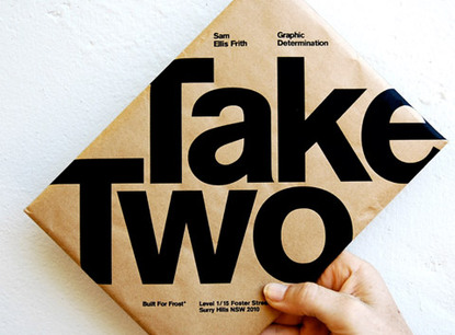
Take Two
I call this typography takeover. When the text runs right off the packaging like this image it is important to carefully position the text to give the product a more dynamic and bold feel. It almost hypes you up before you actually open it up. With a design like this, I expect to see something awesome inside of it. This piece is actually subliminal too. When I read the words, "Take Two", I immediately read it again just to make sure that I read it right. With a product like this, it makes me wonder where else this design could be applied to and still look cool. Hey maybe a coffee mug or a protein bar would work? I would have said candy bar but I'm trying to cut back on sweets a little bit. (Just a little haha!)
Donut Seeds!
Who doesn't love donuts? Just the thought of being able to grow your own donuts just makes me feel good inside. If seeds like this really existed, the world would be a better place. See this is the kind of product that would be new to the market, so having some kind of fancy packaging wouldn't matter too much at all to the customers yet unless it had a lot of sales and a good rating.I believe that having a basic yellow background and a handwritten font is a really good choice for the packaging for now. It simply makes you feel warm, relaxed, and happy when you look at it. Hearing the name Donut Seeds is enough to get my attention and at that point, I just want to see them and use them. Now what really would have been impressive is if they had chocolate glazed ones or the assortment ones. Oh and just to let you know, this is going on my awesome list of epic ideas in life!


No comments:
Post a Comment